I'll be honest: the reason I went here is that it is free on Tuesdays. But sometimes being cheap pays off. El Antiguo Colegio de San Ildefonso was founded in the 16th century by the Jesuits and has had a long and complicated history. After the Jesuits (along with all other religious orders) were expelled from Mexico in 1767, it housed various governmental offices, secular educational institutions and even, briefly, American troops.
Now, all that matters is that it is beautiful.
 I've said it before and I'll probably say it again: I love these courtyards. The bustling city streets fade to insignificance in the space of a 10 yard walk, leaving only... this.
 The same courtyard, from above. Birds twitter, the wind rustles the leaves, all you can see above is blue sky. So lovely.
 And they make for some great hallways.
 Oh, man, there has got to be something cool behind a door that awesome.
 Sure enough, it is the Cardinals College (or something like that). The basic idea is that when this place was run by the Jesuits, the bigwigs would periodically get together for some chit chat.
 And so, of course, they needed insanely beautifully carven chairs on which to rest their religious rumps. Look back at the previous picture. Every single seat in the entire room looks like this. Unfortunately, I wasn't able to get a better shot of the seats or the other great pieces in this room because I was yelled at for taking pictures. Apparently you have to buy their photos of the really nice stuff.
 And at the top of the stairs, a stained glass window. Sure, why not? Let's take a closer look.
 Hey, that's quite nice.
 The main draw of the Antiguo Colegio is its revolutionary-themed murals by Rivera, Siqueiros, Orozco and others. To be honest, I found most of them underwhelming (a future post will focus on some far better murals), though I did like the intensity of this fellow's expression. The odd perspective is a result of this being the ceiling above a stairwell.
 This mural is also pretty great. Note how the fat cat capitalists gleefully debauch themselves while laughing and pointing as the poor fight amongst themselves. This scene was the first of a narrative extending 30 or more yards to the right. Suffice it to say that things went rapidly downhill for the fat cats.
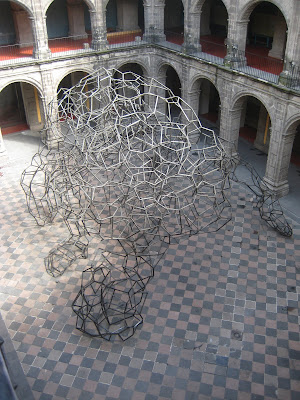
 The clear highlight, though, was this fellow. Look closely: it is a man on hands and knees leaning forward to touch his head (on the left) to the ground.
 The form of the figure is clearer from above.
There was a video playing on loop about how the artist demanded that the Colegio to move the entire piece from the other courtyard (with the trees and plants; first two pictures) to this adjacent courtyard. Apparently, college officials changed the location at the last minute because this courtyard is where they throw cocktail parties. But, the artist insisted and, one very large crane later, his sculpture came to rest as you see here.
Now, normally I am pretty skeptical of hand-wavy artist types talking about space and dialogue with the surroundings and whatnot. But here, the artist was spot on. The other courtyard already had a wonderful balance between the repeating, regular form of the arches and the natural, random greenery in the center. Introducing the harsh angles and random straight lines of this sculpture was thoroughly discordant. Here, though, the balance becomes one of classical form meeting modern lines. However, unlike a shining glass skyscraper towering over an ancient church, in this case the courtyard embraces and surrounds a kneeling figure.
Christ, now I sound like of those hand-wavy types. For whatever reason, it was pretty incredible.
 I've said it before and I'll probably say it again: I love these courtyards. The bustling city streets fade to insignificance in the space of a 10 yard walk, leaving only... this.
 The same courtyard, from above. Birds twitter, the wind rustles the leaves, all you can see above is blue sky. So lovely.
 And they make for some great hallways.
 Oh, man, there has got to be something cool behind a door that awesome.
 Sure enough, it is the Cardinals College (or something like that). The basic idea is that when this place was run by the Jesuits, the bigwigs would periodically get together for some chit chat.
 And so, of course, they needed insanely beautifully carven chairs on which to rest their religious rumps. Look back at the previous picture. Every single seat in the entire room looks like this. Unfortunately, I wasn't able to get a better shot of the seats or the other great pieces in this room because I was yelled at for taking pictures. Apparently you have to buy their photos of the really nice stuff.
 And at the top of the stairs, a stained glass window. Sure, why not? Let's take a closer look.
 Hey, that's quite nice.
 The main draw of the Antiguo Colegio is its revolutionary-themed murals by Rivera, Siqueiros, Orozco and others. To be honest, I found most of them underwhelming (a future post will focus on some far better murals), though I did like the intensity of this fellow's expression. The odd perspective is a result of this being the ceiling above a stairwell.
 This mural is also pretty great. Note how the fat cat capitalists gleefully debauch themselves while laughing and pointing as the poor fight amongst themselves. This scene was the first of a narrative extending 30 or more yards to the right. Suffice it to say that things went rapidly downhill for the fat cats.
 The clear highlight, though, was this fellow. Look closely: it is a man on hands and knees leaning forward to touch his head (on the left) to the ground.
 The form of the figure is clearer from above.
There was a video playing on loop about how the artist demanded that the Colegio to move the entire piece from the other courtyard (with the trees and plants; first two pictures) to this adjacent courtyard. Apparently, college officials changed the location at the last minute because this courtyard is where they throw cocktail parties. But, the artist insisted and, one very large crane later, his sculpture came to rest as you see here.
Now, normally I am pretty skeptical of hand-wavy artist types talking about space and dialogue with the surroundings and whatnot. But here, the artist was spot on. The other courtyard already had a wonderful balance between the repeating, regular form of the arches and the natural, random greenery in the center. Introducing the harsh angles and random straight lines of this sculpture was thoroughly discordant. Here, though, the balance becomes one of classical form meeting modern lines. However, unlike a shining glass skyscraper towering over an ancient church, in this case the courtyard embraces and surrounds a kneeling figure.
Christ, now I sound like of those hand-wavy types. For whatever reason, it was pretty incredible.

I have to say it again, Benjamin, your architectural photography is stunning. Maybe you can be like some of those hand-wavy types and find a gallery to show some prints when you get back...
ReplyDelete...I'll take a copy of that last one; you've caught the reflecting light perfectly.
ReplyDeleteKate, you are too kind.
ReplyDeleteClaudia, check your email.
Hello, my name is Bárbara Bruchez. I'm editor and I'm working on a history book of Viceroyalty of New Spain. I would like to know if you give authorisation for including the first picture of San Ildefonso of your blog.
ReplyDeleteThank you for your kind attention.
Very truly yours,
Bárbara